
IMPROVE THE IMPACT OF YOUR DESIGNS WITH SCIENTIFIC ANALYSIS
As consumers of printed and digital media, we all have opinions on what looks good and what we think will work, but we can now directly offer some objective science, using Visual Attention Software (VAS), to back up or even disprove these opinions.
You can get VAS reports directly from us, within minutes of sending us your images – check out our exclusive offer, for more information – and it is exclusive!
What influences the success of your designs?
We want your campaigns to succeed as much as you do, and one factor that will influence success is how quickly you can get the viewer to engage. In an age where we are bombarded by thousands of marketing messages a day, advertisers have a tiny window in which to grab the viewer’s attention – namely the first 3-5 seconds.
How do you know what works and what doesn’t?
Using the latest visual attention software, we can offer detailed, visual reports to show what your customers will look at in the first 3-5 seconds of viewing your message – this is known as the “pre-attentive processing phase”. At this point, the viewer hasn’t yet had time to process what they’re looking at, and during this time may decide, subconsciously, either to discard your message or if they’re online, just keep on scrolling.
The reports give insight into how successful the image will be, and you can then make improvements to enhance its impact.
The reports work on just about everything visual, including:
- Mail – envelopes, letter, leaflets, brochures, etc.
- Web Pages
- Outdoor Media and Printed Adverts
…the list goes on.
What better case study than our own website
To illustrate the point, let’s take a look at our own website. When we designed it, we used VAS – rather painstakingly I might add – to tweak its design in order maximise the impact of the home page. We sell quite a complex range of services, so for us it was critical that we position the brand alongside a simple, succinct strapline, with a descriptive image to make it all cohesive. After testing dozens of versions, we came up with a design and layout that encompassed what we were trying to achieve.
Using heatmaps
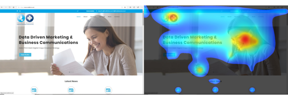
The heatmap (above, right) shows where the viewer’s eye will concentrate on in the first 3-5 seconds – we can then use this information to make improvements to the page to further increase attention and impact. As you can see, our design allows the viewer to focus on the most important areas we want them to. There is no visual clutter on the page.
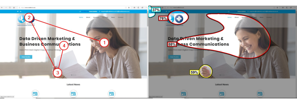
Influencing the viewing order
Further reports (shown below) show you in what order a viewer looks at the various elements in your message, and what percentage of the message (the grey areas) is being ignored.
As you can see from the image on the left (below), our strapline is showing as the last element that will be viewed. This was a really important finding as we wanted it to be the first thing the viewer sees. Thankfully, as this is a website it is not a static image, so we were able to influence the outcome by simply making the strapline the very first element of the page to load, thus dictating the likely order in which the viewer will view the elements on the landing page.
Working with you on your designs
A website is one thing, but what if the image was a piece of mail, where everything is static? How could we change the likely order in which the elements are viewed? This is where our expertise in interpreting the VAS report comes in. When running your design through our software we will come up with suggestions for improvements. Once the improvements are made, we’ll rerun the report and compare the results – and we’ll work with you to maximise the effectiveness of your design.


Latest News